
How Colour Psychology Influences Interior Design
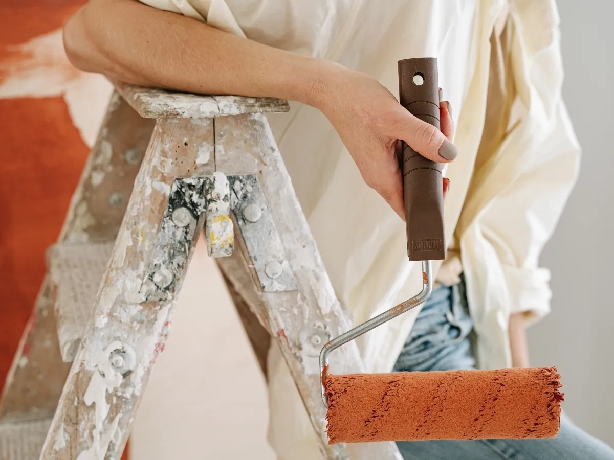
Colour plays a powerful role in shaping the mood and atmosphere of a home. While many people choose paint colours based on personal preference or current trends, the psychological effects of colour are an important factor in interior design. Different colours can influence emotions, energy levels, and overall comfort within a space. By understanding the principles of colour psychology in home design, homeowners can create environments that support relaxation, productivity, or social interaction depending on the purpose of each room.
Certain colours are known for promoting calmness and relaxation, making them ideal for spaces like bedrooms and living rooms. Soft blues, greens, and neutral tones are often associated with tranquility and balance. These colours can help create a peaceful environment where people can unwind after a long day. On the other hand, warmer shades such as yellows, oranges, and soft reds can bring energy and warmth into a room. These colours are commonly used in areas where people gather, such as kitchens or dining rooms, because they encourage conversation and create a welcoming atmosphere.
Thoughtful colour choices can significantly improve both the visual appeal and the emotional experience of a home. Professional painters and designers often guide homeowners in selecting colours that match the intended function of each space. For example, a home office might benefit from colours that support focus and productivity, while a bedroom may be better suited to calming tones that promote rest. By applying colour psychology in home design, homeowners can create spaces that not only look beautiful but also enhance comfort, mood, and overall well-being.
What Is Colour Psychology in Home Design
Colour psychology in home design refers to the way different colours influence human emotions, mood, and behaviour within a living space. Colours interact with light, surrounding décor, and room size, which means they can create very different feelings depending on how they are used. For example, soft blues are often associated with calmness and relaxation, making them popular choices for bedrooms or bathrooms. Bright yellows tend to feel cheerful and energetic, while deeper greens can create a sense of balance and connection to nature. These responses occur because people naturally associate certain colours with experiences, environments, and cultural meanings.
When applied thoughtfully, colour choices can shape the atmosphere and function of a room. Homeowners who want a quiet and relaxing environment may choose softer, cooler tones that promote rest and comfort. Others may prefer bold or warm colours that encourage conversation and energy in social areas such as living rooms or dining spaces. Understanding colour psychology in home design allows homeowners to make more intentional decisions about the mood they want to create in each part of the home. By selecting colours that align with both personal style and emotional impact, it becomes possible to design spaces that feel both visually appealing and comfortable to live in.
Why Paint Colour Matters in Interior Spaces
Paint colour has a powerful effect on how a room feels. Since walls cover a large portion of every room, their colour sets the tone for the entire space. This is why colour psychology in home design plays such an important role in interior painting. The right colour can make a room feel larger, brighter, or more inviting. Lighter shades often reflect more natural light, which helps rooms feel open and airy.
Darker tones may create a cozy and intimate atmosphere. Colour also influences how people experience a room throughout the day. A warm colour can make a space feel welcoming during the evening, while cooler tones may help maintain a calm environment during busy mornings. Professional painters often help homeowners choose colours that enhance both design and function.
Calm Colours for Relaxing Spaces
Many homeowners want their bedrooms and relaxation areas to feel peaceful. Colour psychology in home design shows that certain colours promote calm and comfort. These colours often appear in nature, which is why they feel soothing to many people. Soft blues are one of the most popular calming colours. They remind people of the sky and water, creating a sense of tranquility.
Light greens also provide a relaxing feeling because they are closely connected to nature. Neutral shades such as light grey, beige, or soft taupe can also promote relaxation. These colours create a balanced environment that is easy on the eyes. When these colours are used in bedrooms or reading spaces, they help create an atmosphere where people can unwind after a long day.
Energizing Colours for Social Areas
While some rooms should feel calm, others benefit from a more energetic atmosphere. Colour psychology in home design suggests that certain colours can encourage activity and conversation. Warm colours such as yellow, orange, and red often create a lively environment. These colours can make rooms feel more welcoming and social. Dining rooms and kitchens often benefit from these energetic tones.
Yellow is commonly associated with happiness and optimism. A soft yellow shade can brighten a kitchen or breakfast area. Orange tones may add warmth and encourage conversation in gathering spaces. Red is a bold colour that can stimulate energy and excitement. It is often used in moderation as an accent colour to avoid overwhelming the room. Using warm colours carefully can create spaces that feel vibrant and engaging.
Neutral Colours for Versatile Design
Neutral colours remain popular in many homes because they provide flexibility and balance. Colour psychology in home design shows that neutrals create a sense of stability and simplicity. They allow furniture, artwork, and décor to stand out. Popular neutral paint colours include:
- Soft white
- Warm beige
- Light grey
- Taupe tones
These colours work well in almost every room of the house. They also make it easier to update décor in the future without repainting the walls. Neutral colours can also make rooms appear larger and brighter. This is especially helpful in smaller spaces or areas with limited natural light. Many homeowners choose neutral walls while adding personality through décor and accent colours.
Using Accent Colours to Create Focus
Accent colours play an important role in interior design by helping to create visual focus within a room. In colour psychology in home design, accent colours are used to highlight specific areas and draw attention to key features. These colours are typically stronger or deeper than the main wall colour, which allows them to stand out without overwhelming the entire space. For example, a deep blue or forest green accent wall in a living room can naturally guide the eye toward architectural elements such as fireplaces, built-in shelves, or decorative wall features.
In addition to creating focal points, accent colours help balance and enhance the overall colour scheme of a room. They introduce contrast and personality while complementing the surrounding colours. When used thoughtfully, accent colours can make a space feel more dynamic and visually interesting without making it feel crowded or busy. Professional painters play an important role in achieving this effect by ensuring that accent walls are painted with clean lines and smooth finishes. This careful attention to detail allows the accent feature to stand out clearly while still blending harmoniously with the rest of the room.
How Lighting Affects Colour Psychology
Lighting plays an important role in colour psychology in home design. The same paint colour can look very different depending on natural light and artificial lighting. Understanding this effect helps homeowners make better colour choices. Natural daylight tends to reveal the true tone of a colour. Rooms with large windows may make colours appear brighter and more vibrant.
Spaces with limited natural light may cause colours to look darker. Artificial lighting can also change how colours appear. Warm lighting may make colours look softer, while cool lighting can enhance blue or grey tones. Professional painters often recommend testing paint samples on walls before making a final decision. This allows homeowners to see how colours look throughout the day.
Colour Psychology in Different Rooms
Each room in a home serves a different purpose, which is why colour psychology in home design should be considered carefully. The right colour can support the function of the space. Bedrooms benefit from calming colours that promote rest and relaxation. Soft blues, greens, and neutral tones work well in these areas. Living rooms often use balanced colours that feel welcoming yet comfortable. Warm neutrals and gentle earth tones are popular choices. Kitchens and dining areas may feature brighter colours that encourage energy and conversation. These spaces often benefit from warm tones or cheerful accents. Choosing colours that match the purpose of each room helps create a home that feels harmonious and comfortable.
Selecting the perfect paint colours can sometimes feel overwhelming. With so many options available, homeowners may struggle to visualize how colours will look in their space. This is where professional painters can provide valuable guidance. Experienced painters understand colour psychology in home design and how different shades interact with light and décor. They can recommend colour combinations that enhance the overall design of a home. Our professional interior painting services help homeowners choose colours that reflect their style while creating the right mood in each room. With expert advice and quality application, the final result looks polished and balanced. Professional painting ensures colours appear exactly as intended once the project is complete.
Colour Planning for New Homes
Colour psychology in home design is also important in new construction homes. When building a new house, homeowners have the opportunity to create a complete colour plan from the beginning. Choosing coordinated colours for walls, trim, and accents ensures a consistent design throughout the home. This approach helps rooms flow naturally from one space to the next. Our new construction painting services allow homeowners to personalize their new homes with carefully selected colours. Professional planning ensures each room feels intentional and harmonious. Starting with the right colours helps new homes feel comfortable and welcoming from the moment people move in.
Final Thoughts
Colour has the power to change how a home feels. Through colour psychology in home design, homeowners can create spaces that support relaxation, energy, and comfort. The right paint choices help shape the atmosphere of every room while enhancing the overall style of the home. At Balzer’s Brushing, we believe paint is one of the most effective ways to transform a space.
Our experienced team helps homeowners select colours that reflect their vision while ensuring beautiful and lasting finishes. If you are ready to update your home with colours that enhance both design and mood, our team is here to help. Visit our contact page to connect with Balzer’s Brushing and discover how professional painting can bring your interior design ideas to life.
